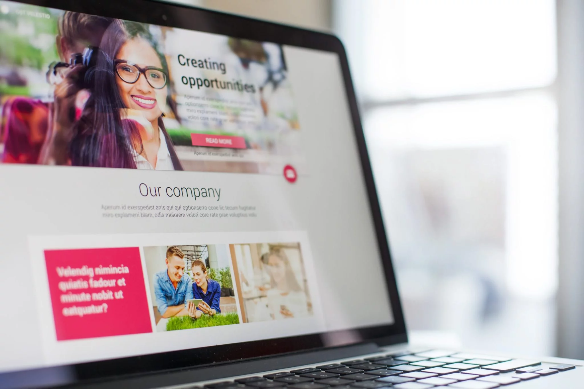
First impressions are everything. Make a good one, and people remember. Make a bad one, and they'll never forget. First impressions extend beyond a firm handshake and eye contact. Most likely, your website is the first place new customers will go to find out about your business. In fact, users form an opinion about your business in 50 milliseconds (that's .05 seconds!) after your page loads. Does your website make the right impression?
Our web designers reveal the most common website mistakes they see, and offer tips on how to avoid them. 
Mistake #1: Too Much Going on Too Fast
One of the biggest mistakes is trying to serve people too many things as soon as they get on your site. Think about your business and decide what you want your main website points to be and ask yourself these questions:
- What is your call to action?
- Who are you serving?
- What is the point of education?
- How are you going to drive people to your site?
The main goal is to not overwhelm people when coming to your site. Adding too many buttons can get confusing quickly. It makes for a bad user experience and can lead to you having less traffic and therefore fewer results. Our recommendation is to keep it simple so people can navigate easily through your site.
Mistake #2: Failing to Set Goals
It’s great to have goals for your site, but make sure you are setting reasonable expectations. Your site isn’t going to be 100 percent perfect overnight. It takes some time to build online awareness - search engine optimization (SEO). Make sure you are clear about what you want your website to do for you. Then build it around those goals. For example, one website may integrate with online purchasing platforms like Shopify. In that case, the main goal is to drive sales...and the website should make it easy for a customer to find what they want to buy and make a purchase. For someone else, the purpose of the website may be to share information about topics that people need to know, so the site will focus on information dissemination with blogs, podcasts, eBooks, white papers, etc.
Do you want people to contact you directly, schedule appointments, or even make and order their own pizza? The bottom line, know what you want your website to do for you...and then design it for that purpose.
Mistake #3: Flashy Trends
The key to remember with trends is that they come and go so quickly. You may feel like you need to add something to your site because that’s what is currently trending, but it may not be the best fit for your site. Web Designer, Katelyn Oneal, says, “When I started building sites several years ago, sliders were a big thing, which initially sounds great! It moves, grabs attention, and can fit several calls-to-action in a small space.” She continues, “However, with more mobile users and shorter attention spans, you should try to focus on one main message which will load faster and work well on mobile devices.”
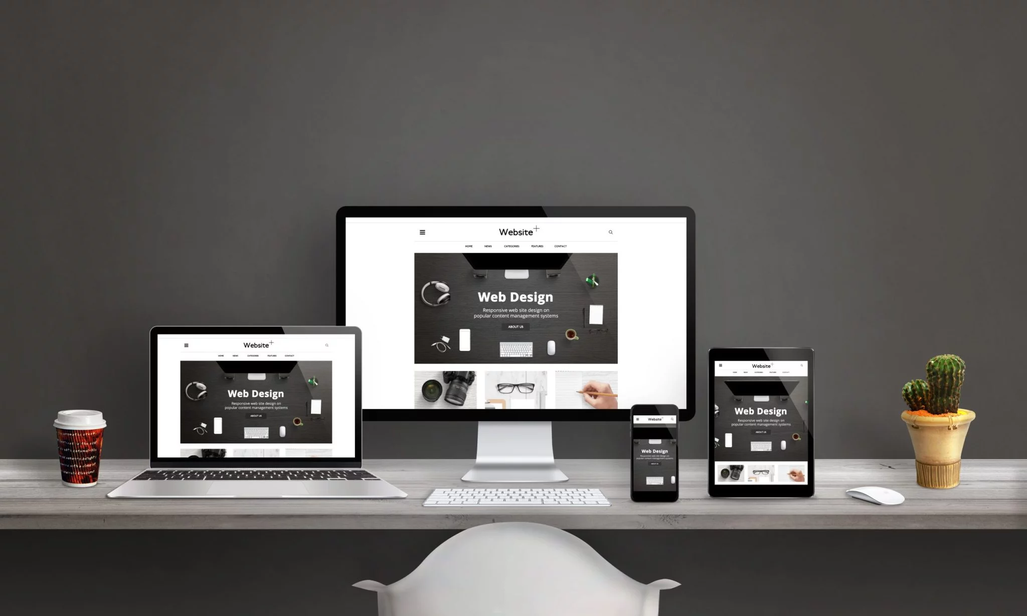
Another trend that is still popular is using a background video on your homepage. It can look cool and make your site seem more advanced, but it also can be very glitchy. It can cause your site to run slowly and not work on mobile. Would you rather your site run fast and be responsive for mobile, or have a video? Don't sacrifice functionality for aesthetics. It may be flashy and new...but does it deliver results and a positive user experience.
Mistake #4: Lack of Quality Content
You know the phrase 'content is king'? Well, that's only true of quality content. A lack of quality content will drive visitors away. It also will keep you from getting a good position on Google search results. If customers are searching for questions you can answer, but your information isn't relevant or is poorly written, you lose.
Here are a few points to consider:
- Poor content is difficult to read.
- Poor content is feature-based, not benefit-based.
- Poor content is not customer-focused.
When your content fits quality standards, THEN it should fit quantity standards. Getting your blogs ranked on the first page won't happen without both. Google 'rewards' content that matches what people are searching for - so keeps it customer-focused. After that, it's about achieving critical mass. The rule of thumb is that it takes about 50 blogs to achieve the online momentum needed to get your site ranked higher.
1. Do a Self-Assessment of Your Website
Conduct an informal review. Ask a few people, not connected to your business, to look at your website and offer feedback. Ask them their initial impressions. Is anything hard to find or frustrating? Do they understand quickly what you are offering and how to take the next step? The most successful websites are customer-focused, paying attention to how easy it is to find needed information and quickly assess what your business is all about.
2. Google Yourself
Search for your business name as well as categories of products and services you offer. Does your website even show up on the first page? Who's ahead of you? What does their website look like? Is there anything you can learn from those who have a higher rank than you?
The good news is that web development software constantly evolves with new options that can make your website better looking and easier to understand and navigate. Keep an eye out, though, for those four most common website mistakes - mistakes that keep customers from returning to your site.
The Bottom Line
Your website is crucial. Customers form opinions about your business and decide whether or not to do business with you BEFORE they ever walk into your business or call you. If your website is bad, you may be losing customers you didn't even realize you could have had. If you still have questions, contact us for a free consultation. We're here to help. 


.webp)


